Graph Excel Data from Multiple Sheets (Dual-Axis, Cleaned): Skip the Manual Excel Work
Zedly AI Editorial TeamJanuary 24, 202612 min read
You searched "graph Excel data" but what you actually have is a workbook with five tabs, inconsistent timestamps, a few obvious outliers, and a manager who wants a dual-axis chart by end of day.
The charting part is easy. The data wrangling is the problem.
This guide covers the realistic ways to graph Excel data when your data lives across multiple sheets. We'll start with native Excel approaches, explain where they break down, and then show a workflow that lets you describe the chart you want and get it built automatically, outlier removal and dual-axis formatting included. If you are evaluating tools for this kind of work, see our buyer's guide to online AI data analysis systems.
Why "Graph Excel Data" Is Really "Graph Multiple Tabs"
In the real world, Excel workbooks aren't single clean tables. They look like this:
Sheet 1: DataRawMix (raw material measurements)
Sheet 2: DataCf Silo No Dust (silo readings)
Sheet 3: DataClinker (output measurements)
Sheet 4: Reference tables, notes, or metadata
Each sheet has similar columns (PlantID, Timestamp, Na2O, K2O, etc.) but the data represents different process stages. You need to compare them on one chart.
The Hard Part Isn't Making a Chart
Excel can make charts. The hard part is everything before the chart:
Pulling consistent columns from each sheet: Column names might differ slightly, or be in different positions
Filtering: You only want PlantID 2008, or data from the last 90 days
Removing outliers: That one reading at 47% Na2O is clearly a sensor error
Aligning timestamps: Sheets may have different sampling frequencies
Building dual-axis charts cleanly: One series on the left axis, two on the right, with readable scaling
By the time you've done all that, the chart is almost an afterthought.
Quick Decision Guide: 4 Ways to Graph Excel Data
One sheet, clean table: Use Excel's standard Insert Chart. Select your data, pick a chart type, done.
Multiple sheets, same layout: Add series manually from each sheet, or consolidate into a helper sheet first.
Messy multi-sheet, repeatable analysis: Power Query to append/transform, then PivotChart. Good if you'll refresh the data monthly.
Messy multi-sheet + filtering + outlier removal + dual-axis: AI/Python sandbox workflow. Describe what you want, get the chart. Best for complex one-off analysis or when you need to iterate quickly.
The Excel Approach (Manual): What People Usually Try
Before reaching for other tools, most people try to solve this in Excel. Here's what that looks like:
Add Series from Other Sheets
Create a chart from Sheet1, then use "Select Data" to add series from Sheet2 and Sheet3. You'll type formulas like =DataClinker!$B$2:$B$500 for each series. This works but gets tedious with many sheets, and you're locked into fixed ranges.
Create Helper Sheets / Consolidate Ranges
Build a summary sheet that pulls data from other sheets using formulas or copy-paste. Then chart from the summary. This adds maintenance burden: every time source data changes, you may need to update the summary.
PivotTables and Power Query
Power Query can append multiple sheets into one table, and PivotCharts can summarize the result. This is the most robust native Excel approach for repeatable workflows. But it requires learning Power Query, and dual-axis charts with multiple series from different sheets still take careful setup.
Where It Breaks Down
Dual-axis with multiple series is fiddly: Getting the right series on the right axis, with appropriate scaling, takes trial and error
Outlier removal is manual and error-prone: You have to visually identify outliers, delete or hide those rows, and hope you didn't miss any
Multi-sheet alignment takes time: If timestamps don't match exactly across sheets, you need to decide how to handle gaps
Changes require rework: New data? Different filter? You're rebuilding pieces of the workflow
There's another approach: instead of building the chart step by step, describe what you want in plain English and let an AI-powered system handle the mechanics.
The workflow:
Upload your workbook: The system reads all sheets and understands the structure
Describe the chart: Specify which sheets, which columns, filters, outlier rules, and axis layout
Get the result: The system writes Python code, loads the data, cleans it according to your rules, and produces the chart
You can review the generated code if you want to understand or modify it. Or just take the chart and move on.
This approach shines when:
You have messy multi-sheet data
You need to filter, clean, or transform before plotting
You want to iterate quickly ("now show me just the last 30 days")
You'd rather describe what you want than click through menus
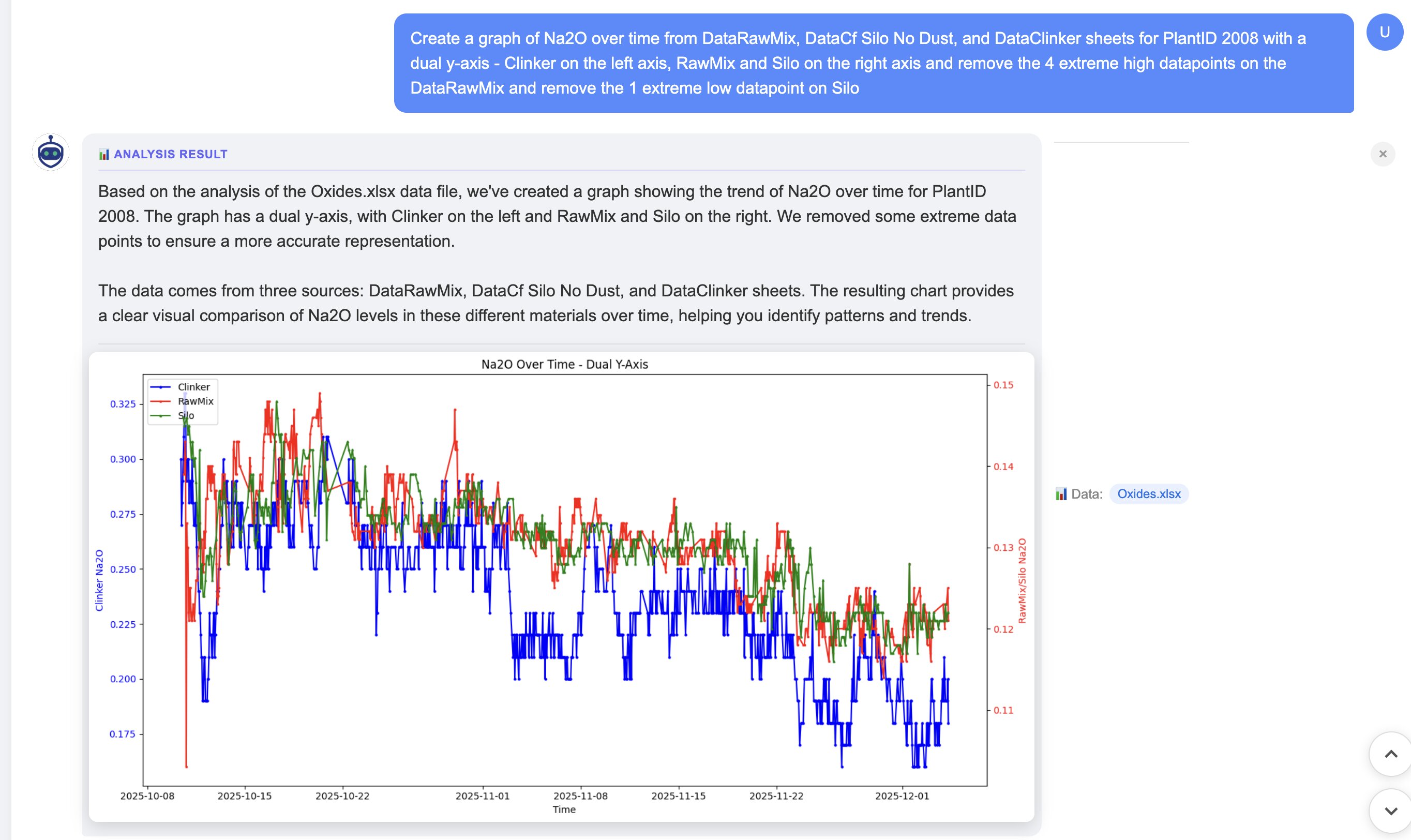
Let's walk through a real example. This is the kind of chart request that would take 30+ minutes in Excel but takes about 30 seconds with the right workflow.
The Workbook
Sheets: DataRawMix, DataCf Silo No Dust, DataClinker
Columns: PlantID, Timestamp (or Date), Na2O, and others
Goal: Compare Na2O levels across all three process stages for PlantID 2008
The Exact Prompt
Create a graph of Na2O over time from DataRawMix, DataCf Silo No Dust, and DataClinker sheets for PlantID 2008 with a dual y-axis. Clinker on the left axis, RawMix and Silo on the right axis. Remove the 4 extreme high datapoints on the DataRawMix and remove the 1 extreme low datapoint on Silo.
What Happens Under the Hood
When you submit this prompt, the system:
Reads all 3 sheets from your uploaded Excel file
Filters rows to only include PlantID == 2008
Extracts the Na2O column plus the time column from each sheet
Removes outliers:
Top 4 highest Na2O values from DataRawMix
Lowest 1 Na2O value from DataCf Silo No Dust
Aligns the time axis across all three series
Plots with dual y-axis layout:
Clinker on the left axis (different scale)
RawMix and Silo on the right axis (similar scale)
The Result
Dual y-axis chart: Clinker (left axis) vs RawMix and Silo (right axis), with outliers automatically removed
What You Get
The chart itself: Clean dual-axis visualization ready to export or embed
Summary notes: How many points were removed from each sheet, the date range used, any missing timestamps that were handled
The code (optional): Review or modify the Python that generated the chart
Why This Workflow Is Faster (and Safer) Than Manual Charting
Repeatable
Got a new month of data? Upload the new workbook and run the same prompt. No need to rebuild the chart from scratch or remember which cells you referenced.
Transparent
The system generates Python code you can review. If something looks wrong, you can see exactly what transformations were applied. No hidden magic.
Flexible
Want to change the date range? Add another sheet? Use a different outlier method? Tweak the prompt instead of rebuilding the chart. Iteration takes seconds, not minutes.
Handles Real Messy Data
Missing values, inconsistent timestamps, outliers, different column names across sheets: the system can handle these with explicit instructions. In Excel, each of these requires manual workarounds.
Copy/Paste Prompt Templates
Here are variations you can adapt for your own data. Replace the sheet names and column names with yours.
Same Chart, Last 90 Days Only
Create a graph of Na2O over time from DataRawMix, DataCf Silo No Dust, and DataClinker sheets for PlantID 2008, but only include data from the last 90 days. Dual y-axis with Clinker on left, others on right.
Use Statistical Outlier Detection (MAD)
Plot Na2O from all sheets for PlantID 2008. Before plotting, remove outliers using median absolute deviation (MAD) with a threshold of 3. Dual y-axis layout.
Group by Week and Plot Rolling Average
Graph Na2O over time from DataRawMix and DataClinker. Group data by week and plot a 4-week rolling average for each series. Single y-axis is fine.
Add Control Limits / Spec Lines
Plot Na2O from DataClinker over time. Add horizontal lines at 0.8 (lower spec limit) and 1.2 (upper spec limit). Highlight any points outside these limits in red.
Plot Multiple Variables Together
Create a dual-axis chart from DataClinker: Na2O on the left axis, K2O on the right axis. Both over time for PlantID 2008. Remove any obvious outliers.
Compare Two Plants
Plot Na2O from DataClinker for PlantID 2008 and PlantID 2012 on the same chart. Use different colors for each plant. Single y-axis.
Export Data Table Along with Chart
Graph Na2O from all three sheets for PlantID 2008. Also export a CSV table showing the cleaned data that was used for the chart, including which points were removed as outliers.
Troubleshooting Common Issues
"My time column isn't recognized"
Tell the system which column contains your dates. Example: "The date column is called 'SampleDate' in all sheets" or "Use column B as the timestamp."
"Sheets have different column names"
Specify the mapping. Example: "In DataRawMix the column is 'Na2O_pct', in DataClinker it's 'Na2O'. Treat them as the same variable."
"Dual-axis scaling looks wrong"
The system tries to auto-scale, but you can override. Example: "Set the left axis range to 0.5 to 1.5, and the right axis to 0 to 5." Or ask for log scale if values span orders of magnitude.
"Too many missing values"
Specify how to handle gaps. Options include: "Interpolate missing values," "Forward-fill missing values," or "Drop rows with missing Na2O." The system will apply your rule before plotting.
"Outliers aren't obvious, I'm not sure which to remove"
Ask for a preview first. Example: "Before plotting, show me a table of the top 10 highest and lowest Na2O values from each sheet with their timestamps. I'll tell you which to remove."
"I want to see the code before it runs"
Ask for code-only output. Example: "Generate the Python code to create this chart but don't run it yet. Let me review first."
Frequently Asked Questions
How do I graph Excel data from multiple sheets?
You have several options depending on complexity. For simple cases, use Excel's Insert Chart and add series from other sheets manually (Select Data > Add Series). For complex multi-sheet data with filtering and outlier removal, an AI-powered workflow lets you describe the chart in plain English and generates it automatically, handling sheet alignment, data cleaning, and dual-axis formatting.
How do I make a dual-axis chart in Excel?
In Excel, create a chart with all your series, then right-click the series you want on the secondary axis and select "Format Data Series" then "Secondary Axis." The challenge comes when you have multiple sheets, need to filter data, or want to remove outliers first. For those cases, describing the chart to an AI tool handles the complexity automatically.
How do I remove outliers before graphing?
In Excel, you would manually identify and delete outlier rows, or use formulas to flag them (like values more than 3 standard deviations from the mean). This is error-prone and tedious. With an AI workflow, you can specify outlier removal in plain English: "remove the 4 highest values from Sheet1" or "use MAD-based outlier detection." The system handles the filtering before plotting.
What's the fastest way to graph lab data over time?
For lab data across multiple Excel sheets (common in manufacturing, QC, and research), the fastest approach is uploading your workbook to an AI tool and describing what you want: which sheets, which columns, date range, outlier handling, and axis layout. The system reads all sheets, aligns timestamps, cleans data, and produces the chart in seconds rather than the 30+ minutes manual Excel work would take.
Already Have CSV Data?
This guide focuses on Excel workbooks with multiple sheets, but if your data is already in CSV format, the workflow is even simpler. Our CSV data visualizer accepts CSV files directly -- upload, ask a question, and get your chart. No sheet selection or column mapping needed.
Not sure what is in your file yet? Run a quick CSV data profiling pass first to check for missing values, duplicates, and outliers before you chart.
Try the Multi-Sheet Dual-Axis Demo
Upload your workbook, paste a prompt like the examples above, and get your chart. No formulas, no manual series selection, no fiddling with axis settings.
Works with Excel files up to 50MB. Supports .xlsx and .xls formats.