AI Spend Anomaly Detection from Excel (50k Rows): Merchant + Channel Drivers, Explained
Zedly AI Editorial TeamFebruary 6, 202610 min read
Most spend analysis still happens in Excel. You export transactions, pivot by vendor, eyeball the outliers, and hope nothing slips through. It works until it doesn't: 50,000 rows across multiple sheets, vendor codes that mean nothing, and anomalies buried in the noise.
This article walks through a different approach. Upload the workbook, ask five plain-English questions, and get merchant-level anomaly drivers, macro overlays, and a KPI dashboard, all backed by a computation trace you can audit line by line.
We will use a synthetic financial dataset with 50,000 transactions across 12 linked sheets. Every number in the output comes from deterministic Python computation, not generated text. The AI plans the analysis and narrates the findings; Python does the math.
The Workbook: 12 Tabs, 50k Rows, Zero Setup
The dataset is a multi-sheet Excel workbook built on a star schema: fact tables for transactions, loans, and company financials, linked to dimension tables for merchants, customers, accounts, and companies. Here is what each group contains:
Transaction Layer
FACT_Transactions (50,001 rows): Every transaction with amount, merchant, channel, category, date, and pre-labeled anomaly flags (IsAnomaly, AnomalyType).
DIM_Merchants (304 rows): Merchant metadata including category and channel.
When you upload this file, Zedly auto-detects the FACT_/DIM_ prefix structure, builds a data catalog with semantic role detection (it knows which column is the anomaly flag, which is the amount, which is the merchant ID), and maps all foreign key relationships. No configuration needed.
Click to zoom
Click any tab to view that worksheet. Click the image to zoom in and scroll to explore the data.
Prompt 1: Profile the Dataset
Before analyzing anything, you need to know what you are working with. The first prompt asks for a data profile:
"Profile this dataset: what fields, missingness, duplicates, outliers?"
Behind the scenes, the structured analysis pipeline builds a Data Catalog that does more than count nulls. It detects semantic roles automatically:
Time columns: Picks the primary date axis (PostDate) from multiple date columns.
Dimension keys: Maps MerchantID, CustomerID, AccountID, CompanyID as foreign keys between tables.
Risk indicators: Detects DPD (days past due), CreditScore, DefaultFlag, IsOverdraft.
This catalog becomes the foundation for every subsequent prompt. The pipeline knows which columns to use for grouping, filtering, and joining without you specifying them.
The data profiling response: fields, types, semantic roles, and foreign key relationships detected automatically.
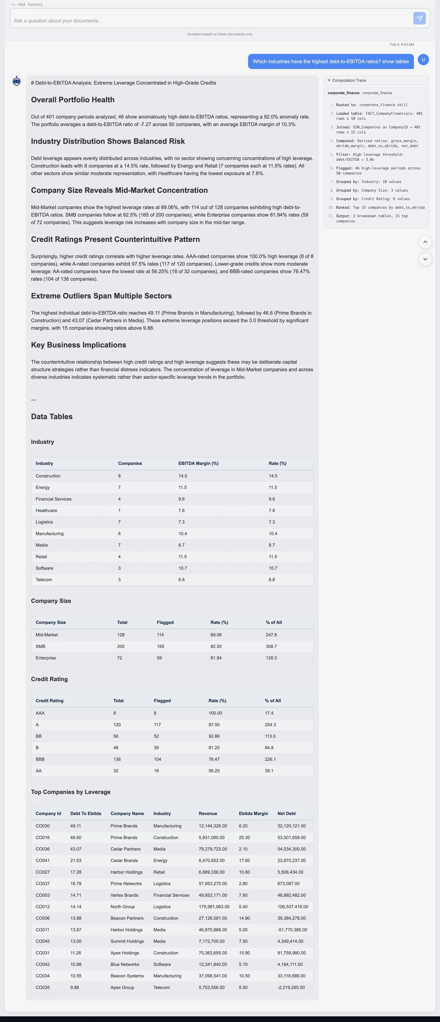
Prompt 2: Which Industries Carry the Most Leverage?
With the data profiled, the next question digs into leverage concentration across the portfolio:
"Which industries have the highest debt-to-EBITDA ratios? show tables"
The pipeline analyzes 401 company periods across 68 companies and returns a full narrative report with data tables:
Portfolio overview: The average debt-to-EBITDA ratio is 7.27 with an average EBITDA margin of 10.8%. Of the 401 company periods, 46 show consistently high ratios.
Industry distribution: Construction leads with 8 companies at a 14.5% rate, followed by Energy and Retail (7 companies each, 11.5%). Healthcare has the lowest exposure at just 1.8%.
Company size: Mid-Market companies show the highest leverage rates at 89.94% (114 of 128), followed by SME at 82.5% and Enterprise at 81.94%. Leverage risk concentrates in the mid-tier.
Credit ratings: A counterintuitive pattern emerges. AAA-rated companies show 100% high leverage (8 of 8), while BBB-rated companies have the lowest rate at 76.47%. This suggests deliberate capital structure strategies rather than financial distress.
Extreme outliers: Prime Brands in Manufacturing tops the list at 41.11x debt-to-EBITDA, with several companies exceeding the 3.0 threshold by significant margins.
Every number comes from pandas groupby and aggregation operations. The Computation Trace panel on the right side of the response shows each step: tables loaded, debt and EBITDA columns identified, grouped by industry, grouped by company size, cross-tabbed by credit rating.
Click to zoom
Debt-to-EBITDA analysis across 68 companies: leverage broken down by industry, company size, and credit rating, with full data tables. Click to zoom and scroll.
This is where traditional analysis in Excel hits a wall. Computing debt-to-EBITDA ratios across 68 companies, then slicing by industry AND company size AND credit rating, ranking outliers, and formatting the results into tables takes dozens of steps in a spreadsheet. Here it's just one prompt.
Prompt 3: Rank Merchants and Channels Driving Anomalies
This is the core of vendor spend analysis: which merchants and channels are responsible for the most anomalies, and why?
The pipeline returns two distinct merchant rankings, because volume and rate tell different stories:
Top Merchants by Volume
M_TRANSFER leads with 18 anomalies from 6,788 transactions. That is a low 0.27% rate, meaning the merchant processes enormous volume and a small percentage triggers flags. The next tier includes M0198 (6 anomalies), M0217 (5), M0008 (5), and M0285 (5).
Top Merchants by Rate
Smaller merchants show the highest anomaly rates. M0150 tops the list at 4.17% (2 anomalies from 48 transactions), followed by M0146 at 3.57% and M0253 at 3.23%. These are low-volume merchants where even one or two flags produce outsized rates, a pattern worth investigating for vendor onboarding risk.
Channel Breakdown
Card transactions drive the majority of anomalies, both by volume and rate. Card: 157 anomalies (0.42% rate, 80.5% of total). ACH: 38 anomalies (0.31% rate). The higher card rate suggests card-specific fraud vectors like duplicate authorization holds and reversal patterns.
Cross-Tab: Merchant x Channel
The cross-tabulation reveals that M_TRANSFER + ACH accounts for 18 anomalies (the single largest combination), while M0028 + Card shows a 2.44% rate on only 5 anomalies. This kind of two-dimensional audit analytics helps pinpoint exactly where to look.
Merchant rankings by volume (left) and rate (right), with channel-level cross-tabulation.
Prompt 4: Overlay Anomalies Against Macro Trends and Events
Anomalies do not happen in a vacuum. Interest rate changes, system events, and economic shifts all influence transaction patterns. The next prompt connects the dots:
"Overlay anomalies vs macro/events timeline; what changed when?"
This triggers the macro_correlation skill, which joins three data sources:
Monthly anomaly rates computed from FACT_Transactions (anomalies per month / total transactions per month).
Monthly delinquency rates computed from FACT_LoanPayments (loans with DPD >= 30 per month).
Macro indicators from the MACRO table: Fed Funds rate, inflation, unemployment, GDP growth.
The skill computes Pearson correlations for every indicator-metric pair. Key findings from this dataset:
Fed Funds rate vs delinquency: r = 0.318, the strongest correlation. Rising interest rates modestly associate with higher delinquency.
Inflation vs delinquency: r = -0.309. Counterintuitive: higher inflation periods coincide with slightly lower delinquency, suggesting other factors dominate.
Unemployment vs delinquency: r = -0.188. Weak negative correlation over this 25-month window.
The EVENTS table adds context: a "Fraud Burst: Online Merchants" event on September 5, 2025 aligns with the month showing the highest anomaly spike. The spike_explain skill can drill deeper into that specific month, showing a +200% increase above baseline with card transactions shifting from 68% to 82% of anomalies.
Macro indicator correlations with anomaly and delinquency rates, plus event timeline context.
Prompt 5: Generate a KPI Dashboard
The final prompt asks for an executive-level summary across the entire workbook:
"Generate a KPI dashboard for this dataset."
This triggers the kpi_dashboard skill, which scans every available FACT and DIM table and pulls one or two headline metrics from each domain. The output includes:
Transaction KPIs: Total volume, total amount, average ticket size, and anomaly rate -- computed from FACT_Transactions.
Loan KPIs: Portfolio size, default rate, average APR, and total principal -- computed from FACT_Loans.
Payment KPIs: Delinquency rate (30+ DPD), on-time payment rate, and average days past due -- computed from FACT_LoanPayments.
Company Financial KPIs: Median EBITDA margin, median debt-to-EBITDA leverage, and the percentage of high-leverage companies (>3.0x) -- computed from FACT_CompanyFinancials.
Customer KPIs: Total customer count and average credit score -- computed from DIM_Customers.
This is the "one prompt to see everything" use case. Instead of building pivot tables across five different sheets, you get a single unified view with every number traceable to a specific table and computation step. The computation trace shows exactly which tables were loaded and which columns produced each metric.
Executive KPI dashboard computed deterministically from every table in the workbook.
The Computation Trace: Proof, Not Promises
Every structured analysis response includes a Computation Trace panel on the right side of the answer. This is an audit log of every Python operation performed:
Step 1: Which skill was selected and why.
Step 2: Which table was loaded and its dimensions (rows x columns).
Steps 3-N: Joins performed, filters applied, columns computed, groupby operations, ranking, and final output summary.
For example, the corporate finance skill trace shows: loaded FACT_CompanyFinancials (401 rows x 10 cols), joined DIM_Companies on CompanyID (401 rows x 16 cols), computed gross_margin, ebitda_margin, debt_to_ebitda, net_debt, filtered high leverage at debt/EBITDA > 3.0x, grouped by Industry (10 industries), grouped by Size (3 values), grouped by CreditRating (6 bands), ranked top 15 companies, output 3 breakdown tables.
This is how you verify that the AI is not making numbers up. Every percentage, every count, every rate in the narrative traces back to a specific Python operation on your actual data.
The Computation Trace panel: every step from table load to final output, fully auditable.
Why This Is Different from Copilot in Excel
Microsoft Copilot in Excel is useful for ad-hoc formulas and quick summaries. But for structured financial analysis on large datasets, the approaches diverge in important ways:
License and Setup
Copilot requires a Microsoft 365 Copilot license ($30/user/month) on top of your existing Microsoft 365 subscription. Zedly requires no plugin, no license tier, and no installation. Upload a file and start asking questions.
Execution Model
Copilot's "Python in Excel" feature executes code in Microsoft's cloud and is still in preview. Each query generates new code from scratch, meaning the same question can produce different code paths and different results. Zedly's structured pipeline routes queries to deterministic Python skills: the same question on the same data always triggers the same computation path.
Validation and Reproducibility
Copilot does not validate its own output. If the generated code produces a number, you see the number. Zedly runs reconciliation checks (do the breakdowns sum to the total?), semantic validation (was the right column used for "channel"?), and narrative validation (does every number in the text appear in the computed results?). The computation trace provides full auditability.
Data Privacy
Copilot sends your data to Microsoft's cloud for processing. Zedly uses ephemeral processing where file contents are auto-deleted after analysis. For teams dealing with sensitive vendor contracts, procurement spend cubes, or audit workpapers, this distinction matters.
Copilot is a good tool for quick formula help and simple data questions. For structured spend analysis, anomaly detection across 50,000+ transactions, and auditable vendor-level breakdowns, a deterministic pipeline with validation is a better fit.
From Excel Pivot Tables to an AI Spend Cube
What Is a Spend Cube?
A spend cube is a multi-dimensional analytical structure that slices total expenditure across three or more axes simultaneously: vendor/supplier, category/commodity, and time period. Optional dimensions include cost center, geography, and business unit. Procurement teams, FP&A analysts, and internal auditors use spend cubes as the foundation for savings analysis, contract negotiation prep, maverick spend detection, and audit scoping.
If you have ever built a set of nested pivot tables in Excel to answer "How much did we spend with Vendor X in Category Y during Q3?", you were building a spend cube by hand.
The Traditional Way: Manual Pivot Tables
Building a procurement spend cube in Excel typically follows this workflow:
Export AP data from your ERP into a flat CSV or Excel file.
Clean vendor names. The same supplier appears as "Staples Inc", "STAPLES INC.", "Staples Office Supply", and "STP-0042". You build a mapping table or use VLOOKUP to normalize.
Classify categories. If your GL codes do not map cleanly to spend categories, you manually assign UNSPSC or internal taxonomy codes to each line.
Build nested pivot tables. Vendor by category, vendor by month, category by cost center. Each pivot is a separate view. Excel does not natively link them.
Reconcile totals. Verify that the sum of your vendor pivot matches the sum of your category pivot matches the grand total. Any filter or slicer mistake breaks this.
Repeat when data refreshes. Next month's export means re-running every step. Pivot table configurations are fragile and undocumented.
The pain points compound: vendor name normalization is error-prone, cross-tab analysis in Excel requires multiple sheets, there is no audit trail of how numbers were derived, and the entire process breaks when a new vendor or category appears in the next export.
How the Structured Pipeline Builds a Spend Cube Automatically
The five prompts demonstrated earlier in this article are not just ad-hoc queries. Together, they build an AI-powered spend cube from your raw data:
Star-schema detection = automatic dimension identification. When you upload a multi-sheet workbook, the pipeline detects FACT_ and DIM_ tables and maps foreign key relationships. These are the axes of your spend cube: vendors, categories, channels, customers, and time periods are identified as dimensions without any manual configuration.
Anomaly drivers = vendor x channel x category breakdowns. The anomaly_drivers skill produces the same multi-dimensional slices that a spend cube provides, but computed deterministically with reconciliation checks. Every breakdown is guaranteed to sum to the total.
KPI dashboard = headline metrics across all dimensions. The kpi_dashboard skill pulls summary KPIs from every FACT table in the workbook. This is the top-level view of your spend cube: transaction volume, default rates, delinquency metrics, and margin analysis in a single output.
Computation trace = the audit trail manual pivots lack. Every number traces to a specific table load, join, filter, and groupby operation. When your CFO asks "Where did this number come from?", you show the trace instead of pointing at a pivot table and saying "trust me."
Deterministic reproducibility. Run the same query on the same data tomorrow and you get the same computation path and the same numbers. No fragile pivot configurations, no accidental slicer changes, no undocumented formula chains.
The result is a procurement spend analysis that updates instantly when new data arrives. Upload next month's export, ask the same five questions, and the pipeline rebuilds the cube. No vendor name cleanup, no pivot table reconfiguration, no manual reconciliation. For teams doing vendor spend analysis in Excel today, this is what an AI spend cube looks like in practice. If your procurement team also tracks goods received without matching invoices, see our GRNI report guide with downloadable template.
Try It: Upload Your Own Export
Everything shown in this article works on your own data. The five prompts are not specific to this synthetic dataset; they work on any multi-sheet Excel workbook with transaction data. For a broader look at what to evaluate when choosing an online AI system to analyze data, including a 30-minute test plan and privacy checklist, see our buyer's guide.
Here is how to try it on your own export:
Upload your Excel file (or CSV) to Zedly.
Ask: "Profile this dataset: what fields, missingness, duplicates, outliers?"
Ask: "Find anomalies by amount, frequency, and vendor-category mismatches."
Ask: "Overlay anomalies vs macro/events timeline; what changed when?"
Ask: "Generate a KPI dashboard for this dataset."
The structured pipeline auto-detects your schema, picks the right analysis skill, and returns validated results with a full computation trace. No code to write, no plugins to install, no formulas to debug.
Can I run spend analysis on Excel files larger than 50,000 rows?
Yes. Zedly processes multi-sheet Excel files with hundreds of thousands of rows. The structured analysis pipeline profiles your data, detects table relationships, and executes deterministic Python skills on the full dataset. There is no row limit imposed by the AI layer.
How does AI detect duplicate invoices in Excel?
The anomaly detection skill flags transactions that match known duplicate patterns: identical amounts to the same vendor within a short window, reversed-then-reposted entries, and category mismatches where a vendor appears under an unexpected expense code. Each flag comes with the computation trace showing exactly which rows were compared.
What is a procurement spend cube and can AI build one from Excel?
A procurement spend cube is a multi-dimensional view of spending across vendors, categories, time periods, and cost centers. Zedly builds this automatically when you upload a star-schema Excel file with FACT and DIM tables. The structured pipeline joins your transaction, vendor, and category dimensions and produces breakdowns by any combination of those axes.
Do I need to install a plugin or add-in?
No. Zedly runs entirely in the browser. Upload your Excel file, type a question in natural language, and receive structured analysis with tables and narrative. There is nothing to install, no Python environment to configure, and no Microsoft 365 add-in required.
Is my data safe when I upload a financial spreadsheet?
Zedly uses ephemeral processing. Your file is loaded into memory for analysis, and all data is auto-deleted after your session. No file contents are stored permanently, used for training, or shared with third parties. The computation trace proves every step without retaining raw data. See our privacy policy for details.
How is this different from writing Python scripts or using pandas?
The structured pipeline uses pandas and Python under the hood, but you do not write any code. The system auto-detects your schema, selects the right analysis skill, validates results with reconciliation checks, and generates a narrative with cited numbers. If you asked the same question twice, you get the same deterministic computation path.
Can I use this for audit analytics on bank transaction exports?
Yes. The pipeline works with any tabular financial data: bank transaction exports, credit card statements, accounts payable ledgers, and multi-entity consolidations. Upload as CSV or Excel, and the anomaly detection, merchant ranking, and KPI skills run the same way.
What Excel formats are supported?
Zedly accepts .xlsx and .xls files with single or multiple sheets. It also accepts .csv files. For multi-sheet workbooks, the system automatically detects star-schema structures (FACT_ and DIM_ prefixed sheets) and builds a data catalog with foreign key relationships.
How do I build a spend cube from an AP export?
Upload your accounts payable export (Excel or CSV) to Zedly and ask questions like "Break down spend by vendor and category" or "Generate a KPI dashboard." The structured pipeline auto-detects vendor, category, and time dimensions, builds the multi-dimensional breakdowns, and validates that every slice reconciles to the total. No pivot tables, no manual vendor name cleanup, no mapping tables required.
Ready to get started?
Private-by-design document analysis with strict retention controls.